The Clinic Website
Project Overview
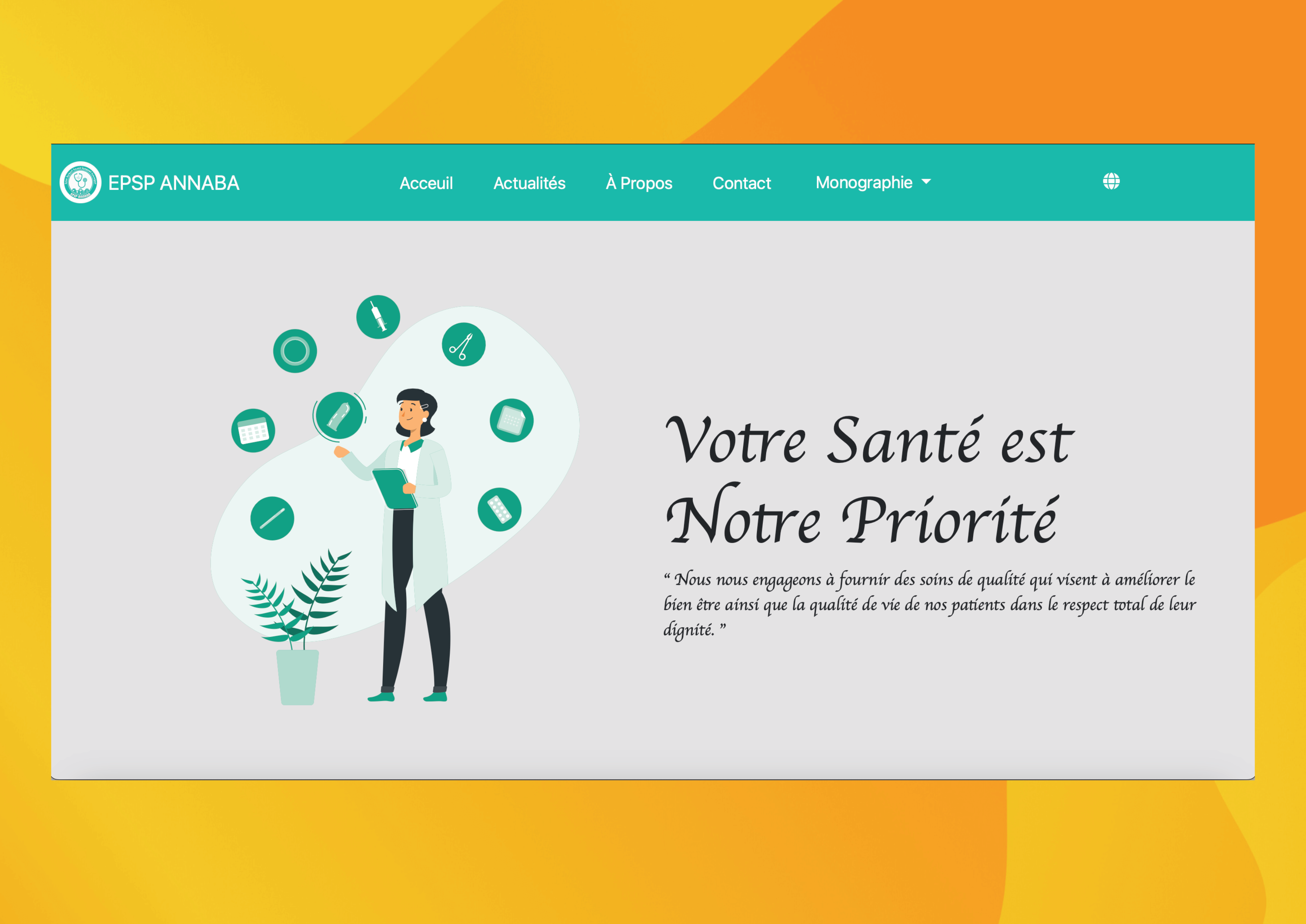
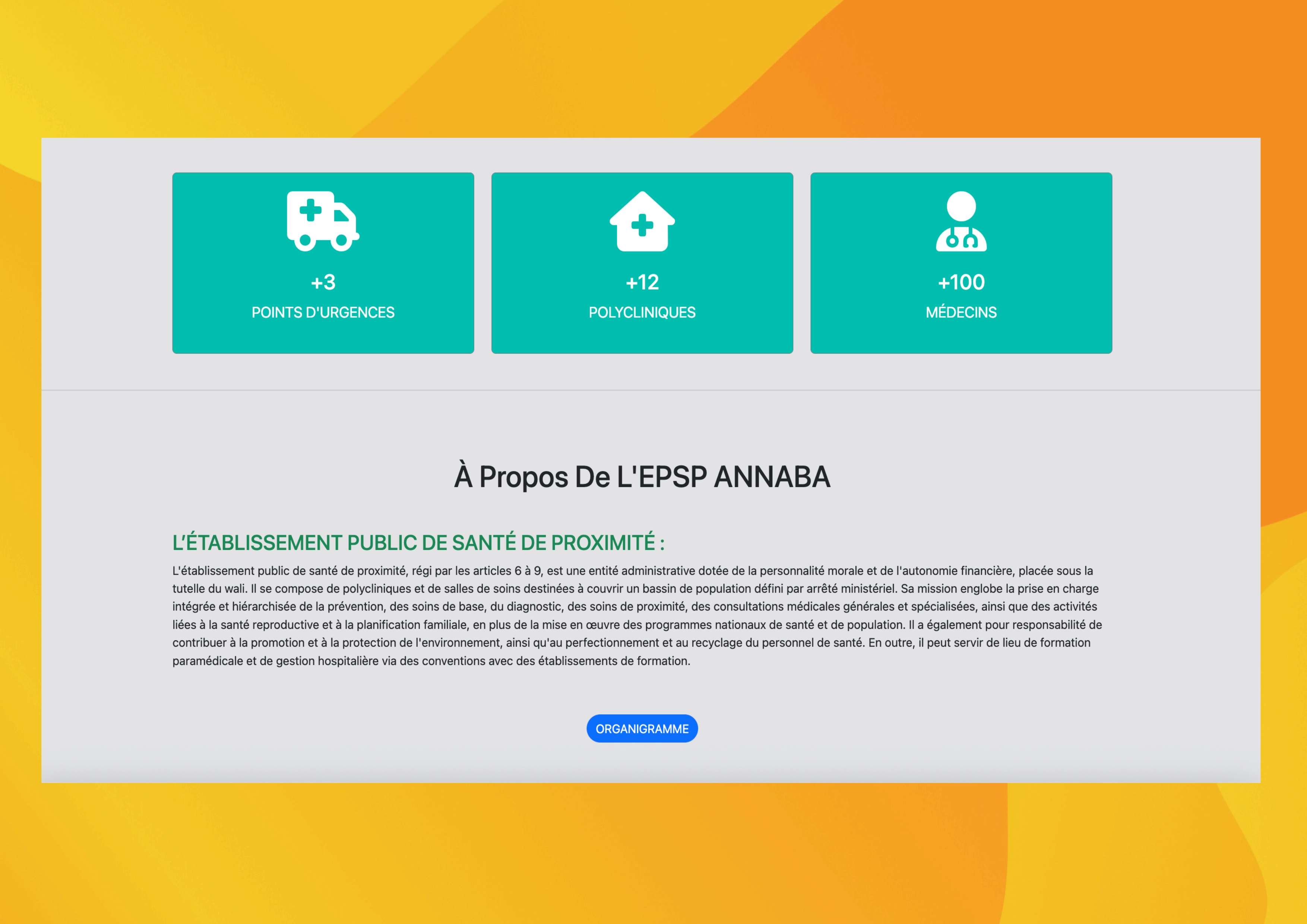
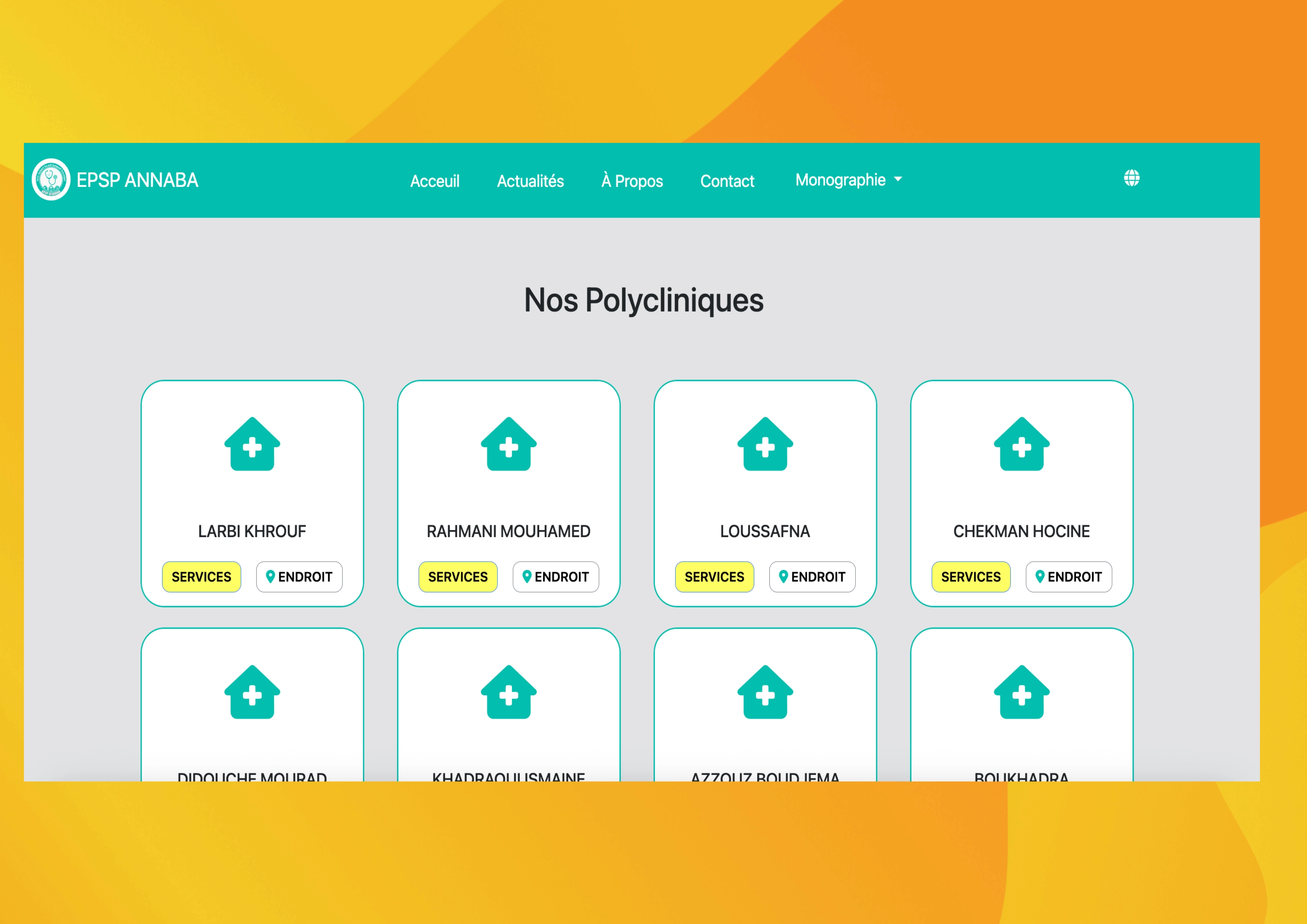
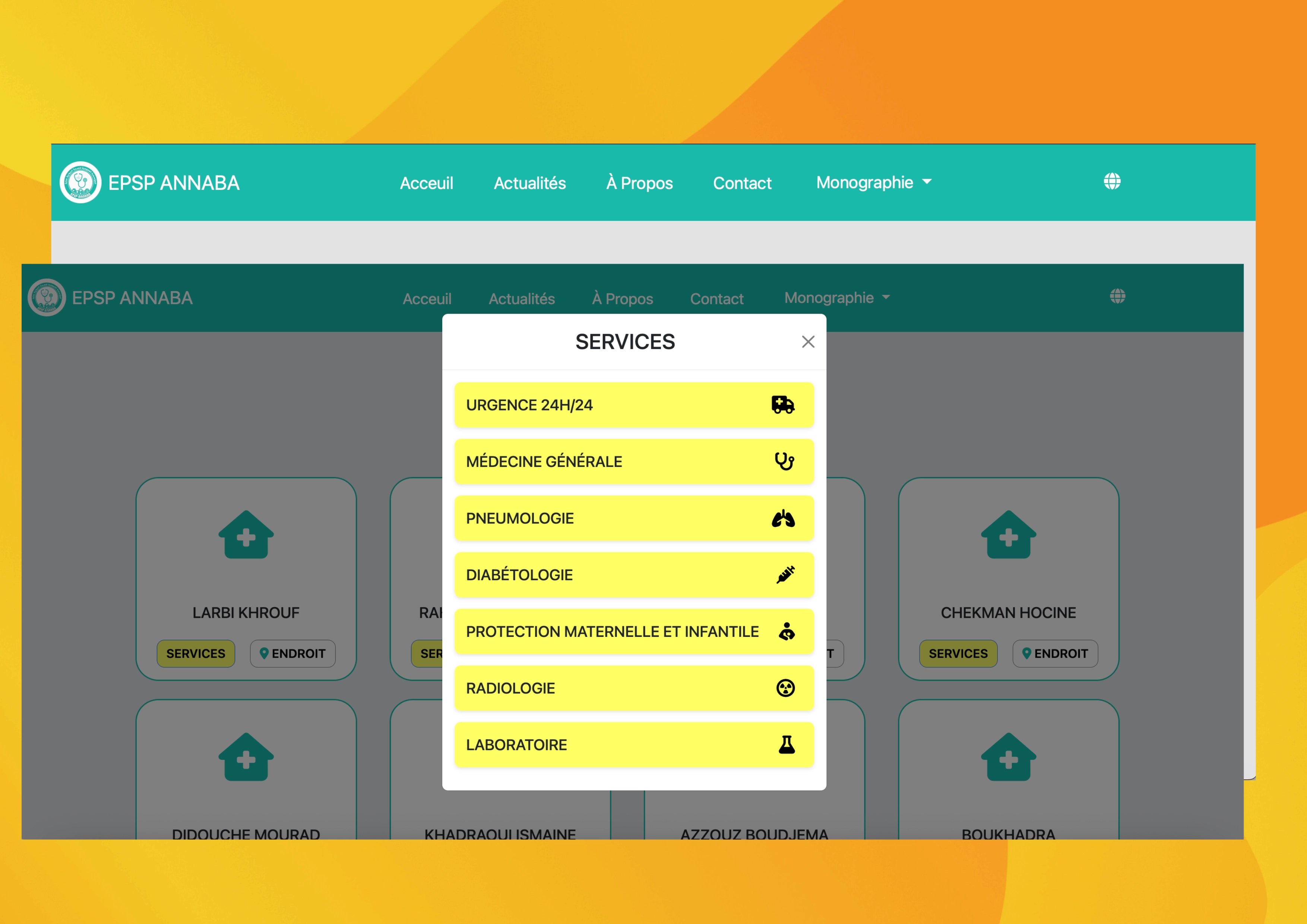
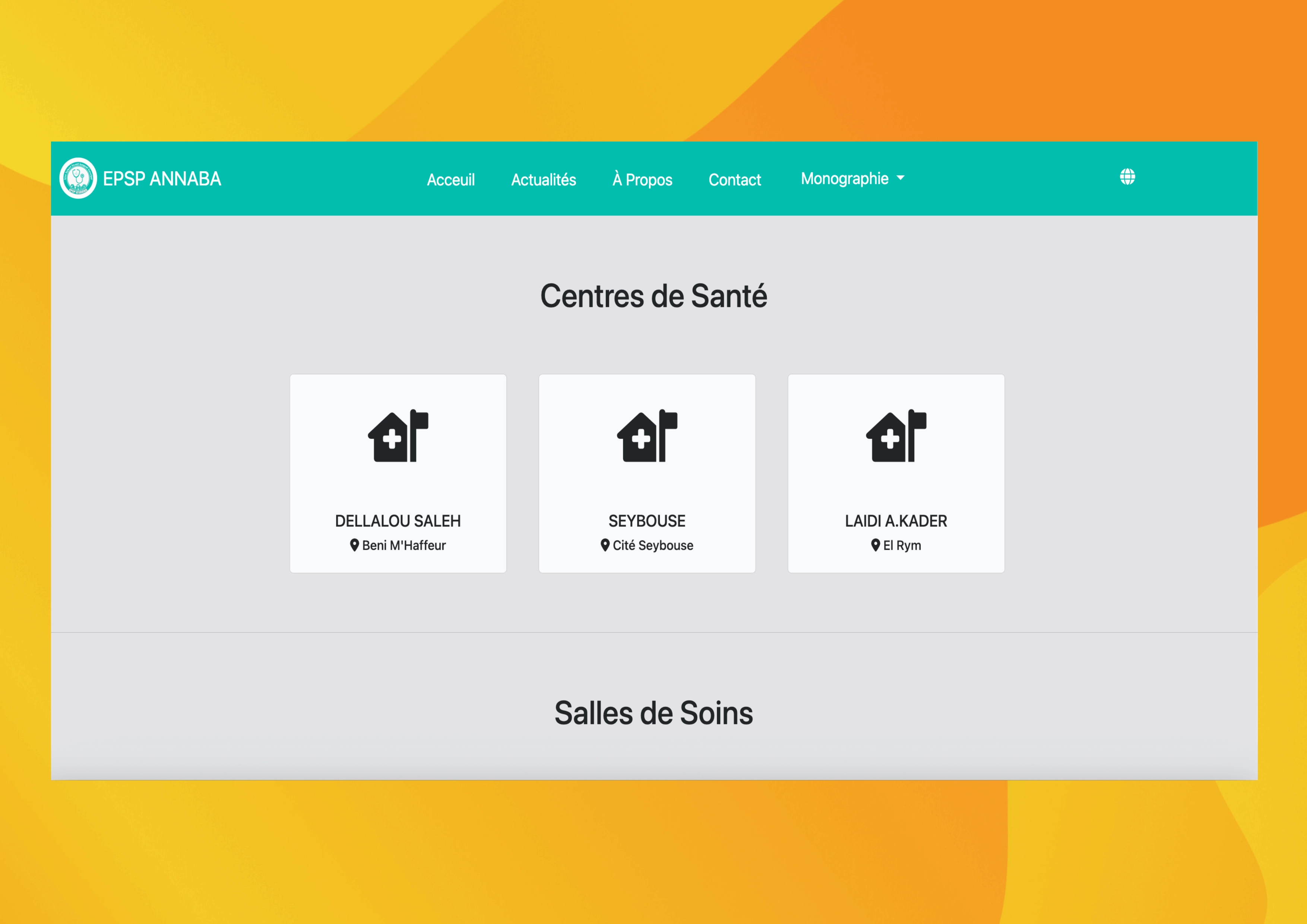
This project involved the development of a modern, responsive clinic website to enhance the clinic’s online presence. The website features intuitive navigation, detailed service information, and a sleek, user-friendly design. By prioritizing accessibility and ease of use, the site ensures that patients can quickly find essential clinic details, and access services seamlessly across all devices.
Technologies Used
Key Features
- Intuitive Navigation – A user-friendly design ensures easy access to important clinic details.
- Comprehensive Service Information – Clearly presented details on available medical services and specialties.
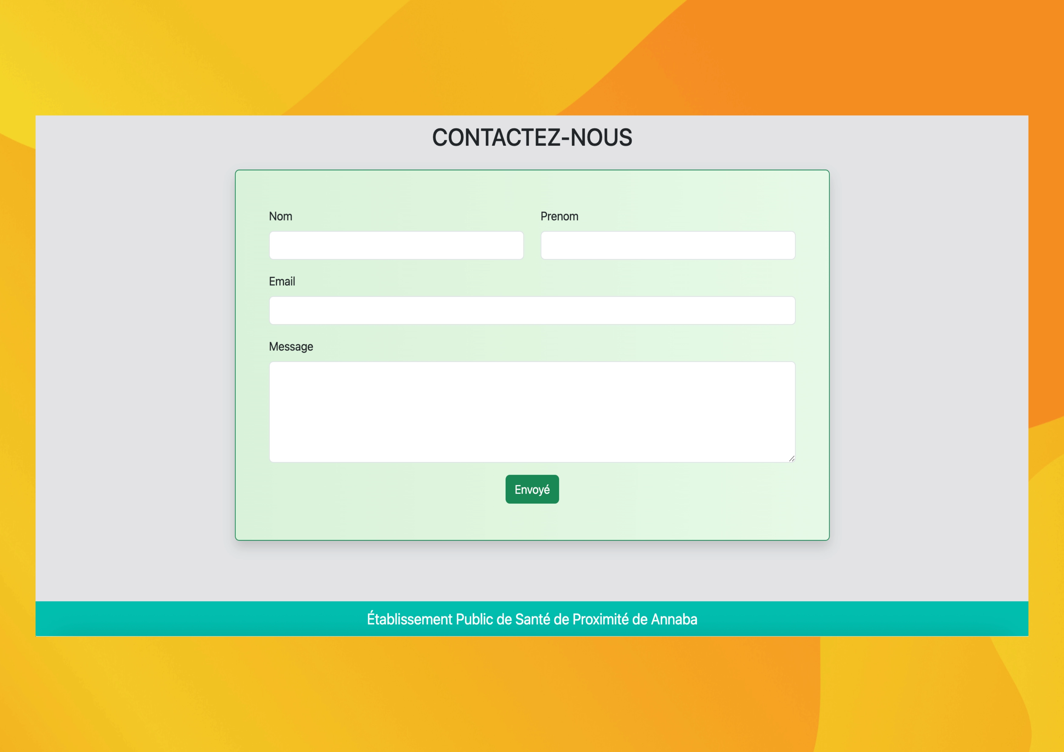
- Contact Form – A simple and secure way for patients to reach out with inquiries.
- Responsive Design – Optimized for seamless browsing on desktops, tablets, and mobile devices.
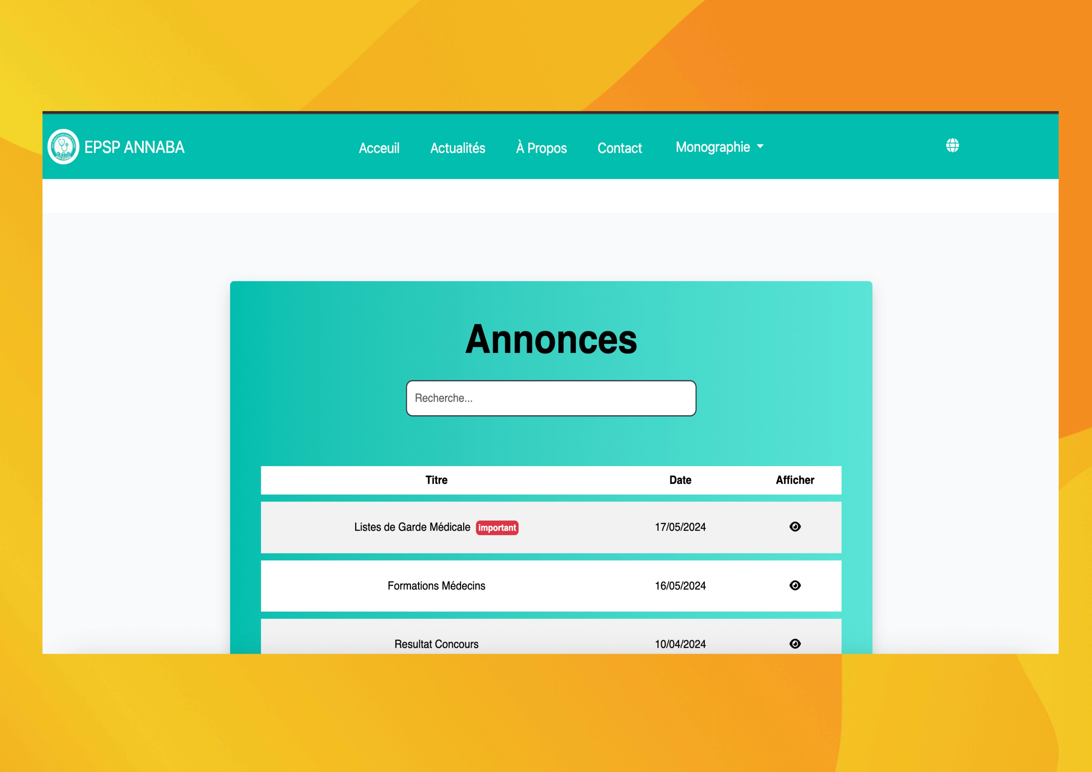
- Announcements Section – Keep patients informed with the latest clinic updates, news, and health tips.
Challenges & Solutions
Building a clinic website sounds straightforward until you realize a medical site has to be trustworthy, fast, and secure for non-technical visitors who are often stressed and just want an answer. These were the moments that taught me the most.
Stopping spam and injection on the contact form
The contact form was the one place where the outside world could write into the clinic’s database, and within days of going live it started collecting junk submissions and suspicious input. I hardened it on two fronts: every field is validated and sanitized on the server before it’s ever touched, and all database writes go through parameterized (prepared) statements so a crafted message can never break out of its query. The result was a contact channel I could actually trust — no SQL injection surface, and the noise dropped to nearly zero. It was the project where “never trust user input” stopped being a slogan and became a habit.
Making one layout feel right on every screen
Early on the site looked great on my laptop and fell apart on a phone — the navigation overflowed and service cards stacked awkwardly. Rather than patch each breakpoint by hand, I rebuilt the layout mobile-first with Bootstrap’s grid and tested against real device widths. By designing for the smallest screen first and letting the layout grow upward, the same markup now reads cleanly from a narrow phone to a wide desktop without duplicated code. It changed how I approach every interface now: start with the constraint, not the comfortable case.
Keeping the site fast for patients on slow connections
Clinic visitors aren’t always on fast Wi-Fi, and the first version felt heavy on mobile data. I went through the page weight line by line — compressing and properly sizing images, deferring non-critical scripts, and trimming unused styles. The payoff was a noticeably quicker first load, which matters most for someone trying to find a phone number or opening hours in a hurry. Performance stopped being an afterthought and became part of how I judge whether a page is actually “done.”